I HAVE RETURNED
It’s been a while, but I finally have something worth sharing. Recall I went offline because the Ohio Department of Health (ODH) added a massive number of backdated deaths to the rolls, which then appeared in the New York Times (NYT) dataset all at once. This resulted in an apparent death spike, which I didn’t like. Therefore, I set out to rebuild my analysis upon the foundation of the ODH data, supplementing it with the NYT values for Kentucky and Indiana since those states do not make their county-level data as readily available as Ohio does. These two datasets have an essential difference that required me to make some decisions. I shall attempt to explain that difference and its consequences:
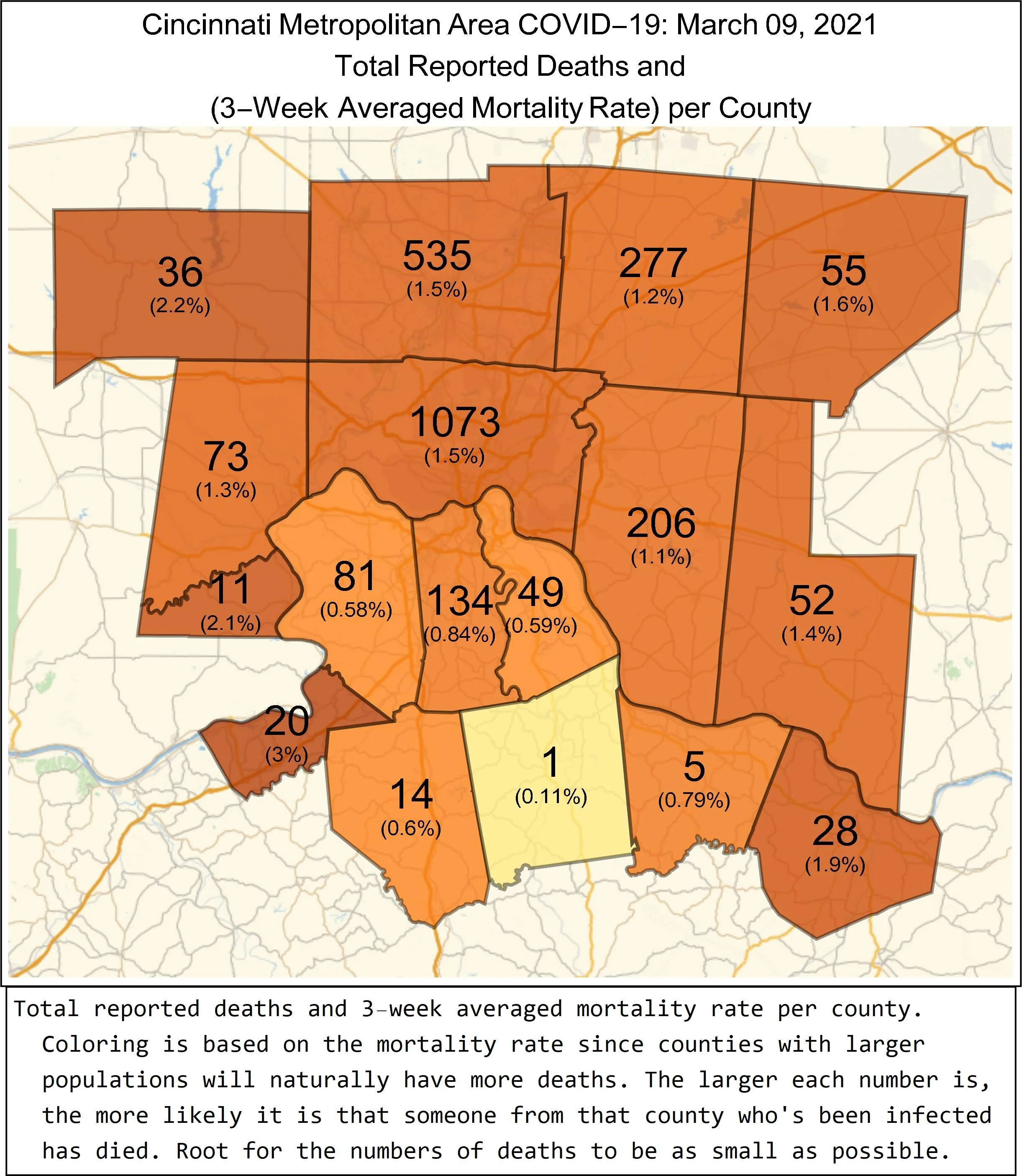
Dates in the NYT dataset refer to when cases/deaths were reported, NOT when those cases/deaths actually occurred. Once data is registered for a given date, those values cannot change. Any new cases/deaths are reported on a different, later date. This is great for building graphs day-by-day because once a data point is added, it stays where it is. However, the inherent reporting delay causes errors in these graphs’ reflection of reality. Sometimes these errors are quite large, as seen when Ohio suddenly reported thousands of deaths that occurred mostly throughout November and December of last year during a single weekend in February.
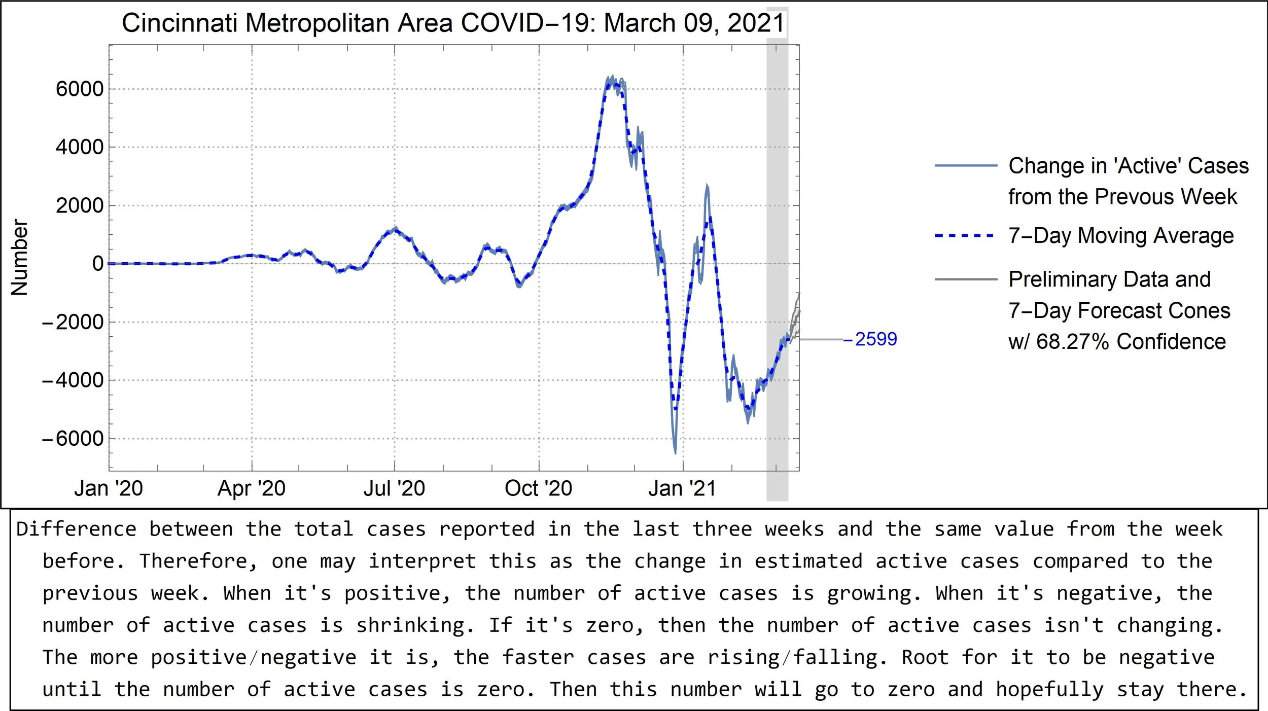
Dates in the ODH dataset refer to when cases/deaths actually occurred. Consequently, values for past dates can and do change as new data is added. While this ultimately more accurately reflects reality, it means that any data point on any graph is subject to change and should not be considered final—they can and do get bigger! More recent data is more likely to change as more cases/deaths are reported. Because of this, the ODH considers all values for the last two weeks to be preliminary. I’ve attempted to indicate that on the new graphs. (Actually, ODH considers all the data to be preliminary, but some data are more preliminary than others.)
These facts and others necessitated changes:
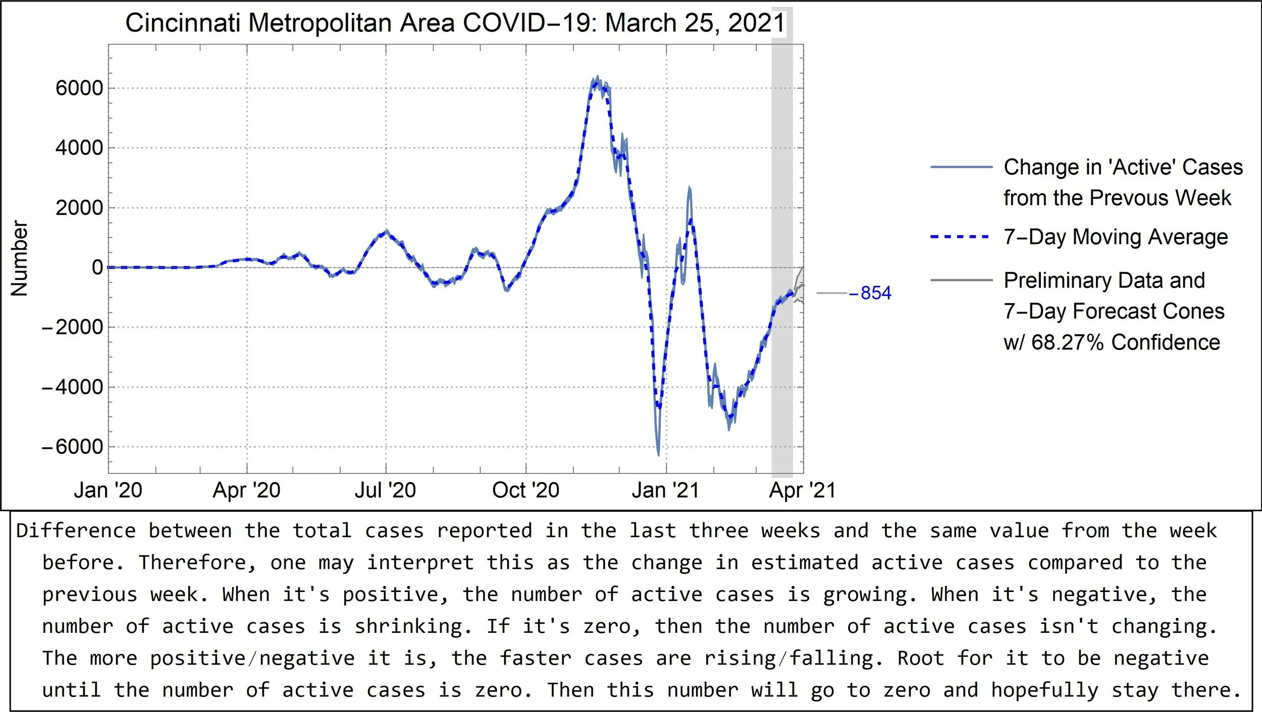
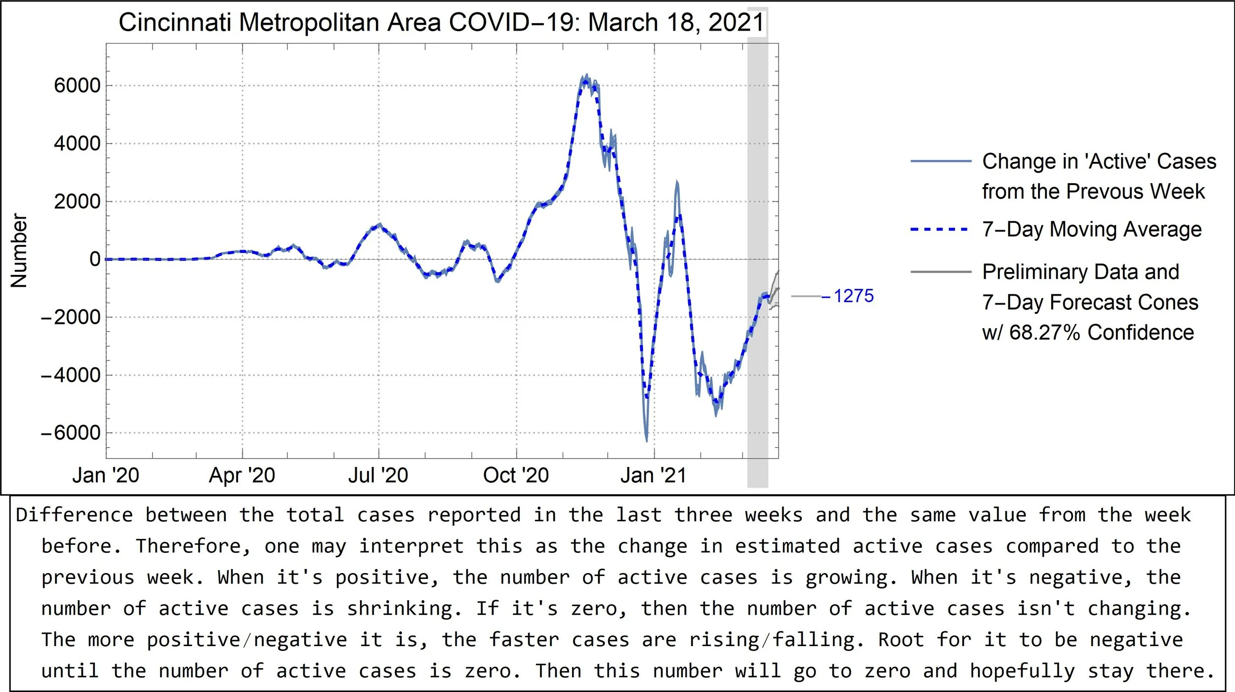
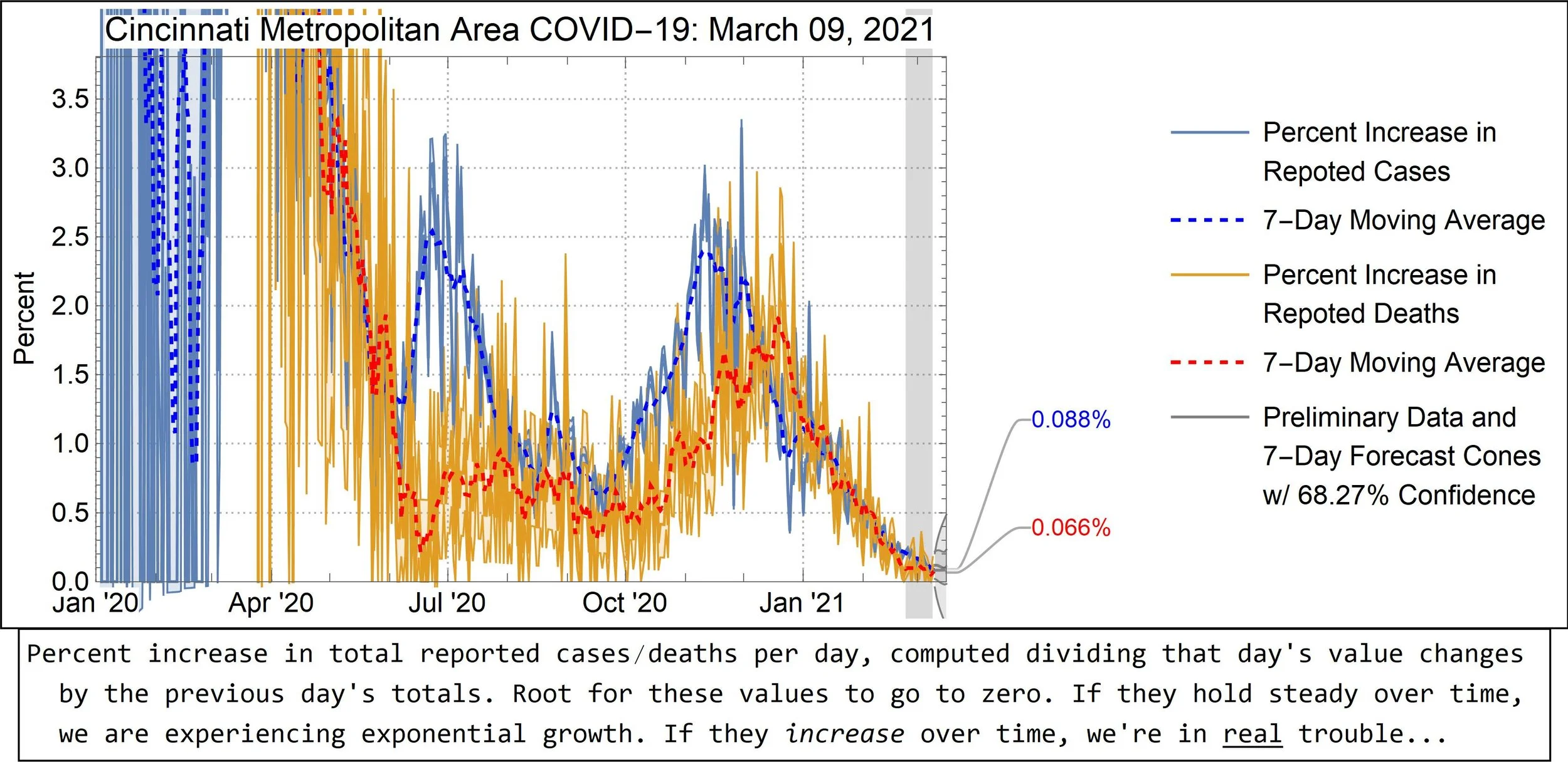
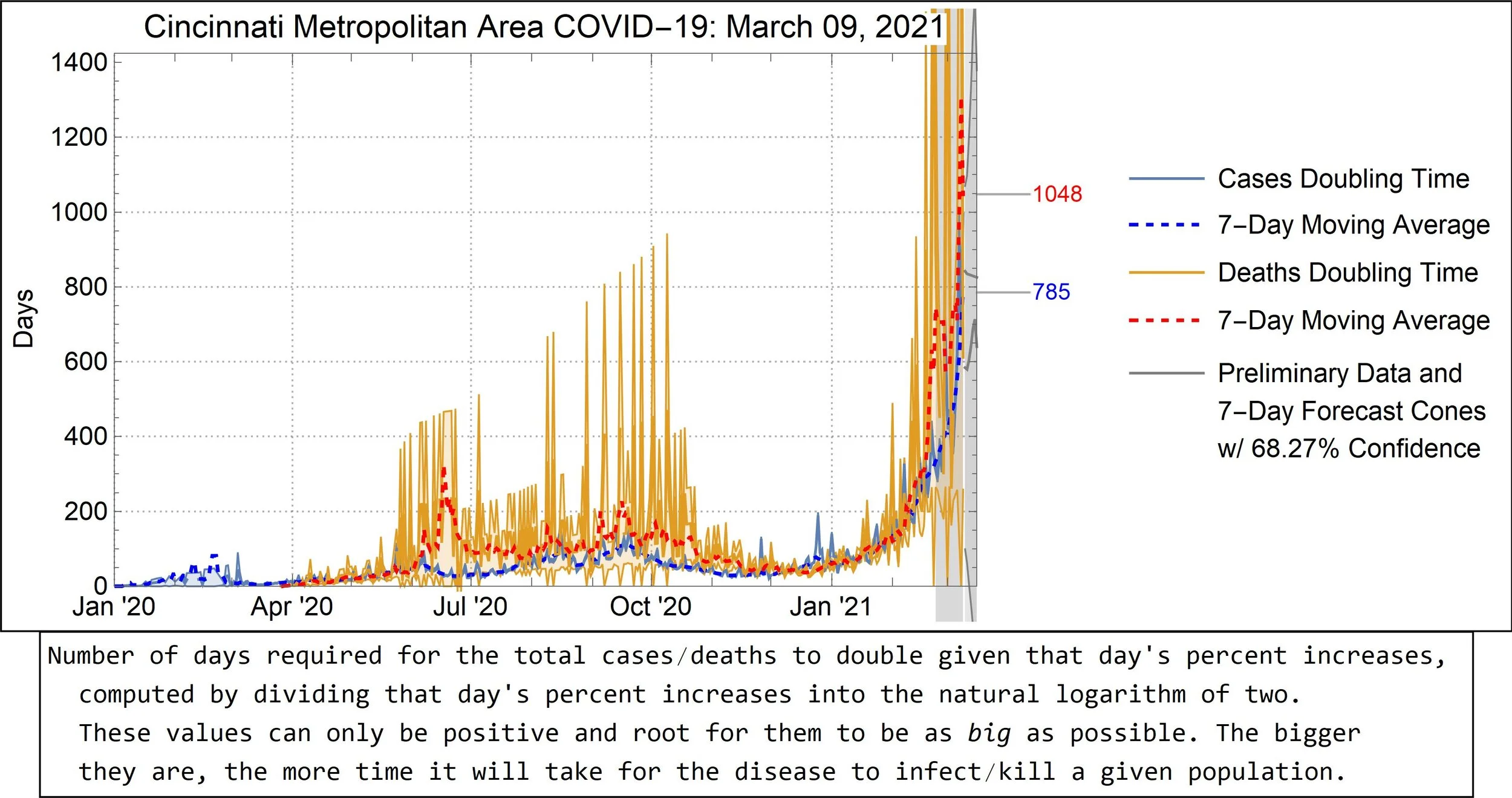
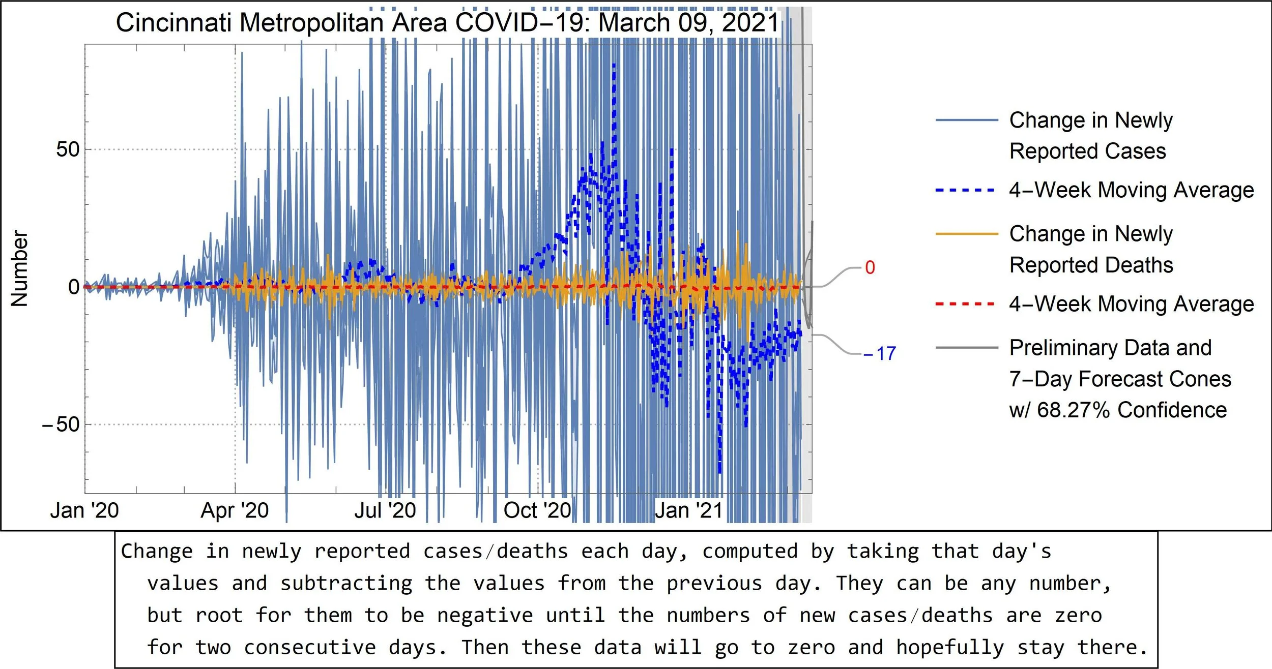
The last two weeks on each graph are marked “preliminary.“
The historical forecast graph has been removed since it’s already well-established that these forecasts can’t predict the future. More importantly, historical forecasts mean nothing if the data behind them can change.
The definition of an “active case” has been extended from one reported in the last two weeks to one reported in the previous three weeks since ODH considers cases to be “recovered” after three weeks—unless the person died.
The start date on the time axes has been extended to January 1st, 2020. (It was previously March 13th, 2020.) This was done because, according to the ODH, there were COVID cases in the Cincinnati area with onset dates as early as January 2nd—months before most of us knew this was going to be a thing!
I’ve added the relevant year to all dates because that’s something we need now as we enter year number two…
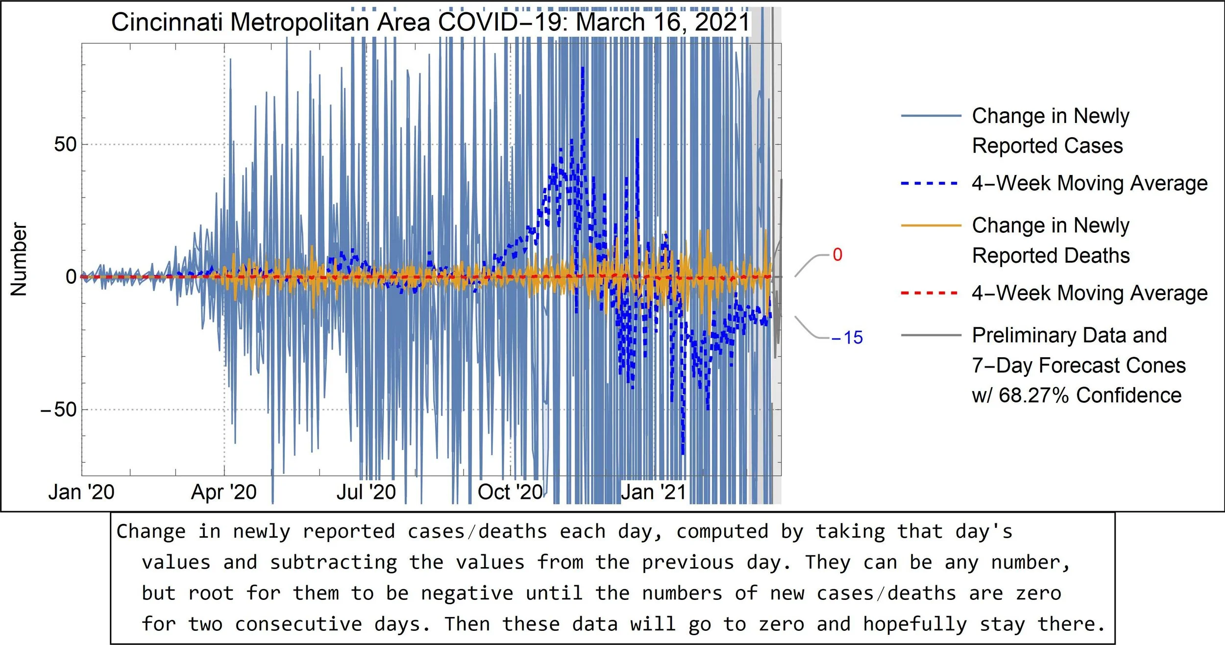
Combining the two datasets was relatively easy. But then I discovered that Mathematica (the program I’m using to do everything) has a problem with error propagation. It tends to make propagated uncertainties way larger than they should be, which, it turns out, explains why the uncertainty bands on most of these plots have been huge. I spent a weekend uncovering this fact and about another week figuring out a way around it. By the end, I learned a lot of new things, and I had a result that I didn’t want to simply plug into my old code. So, I rewrote everything from scratch. I’m not really upset about this because the old stuff was kind of clunky, and the new version is much leaner, faster, and easier to read. And the graphs needed those touchups, anyway.
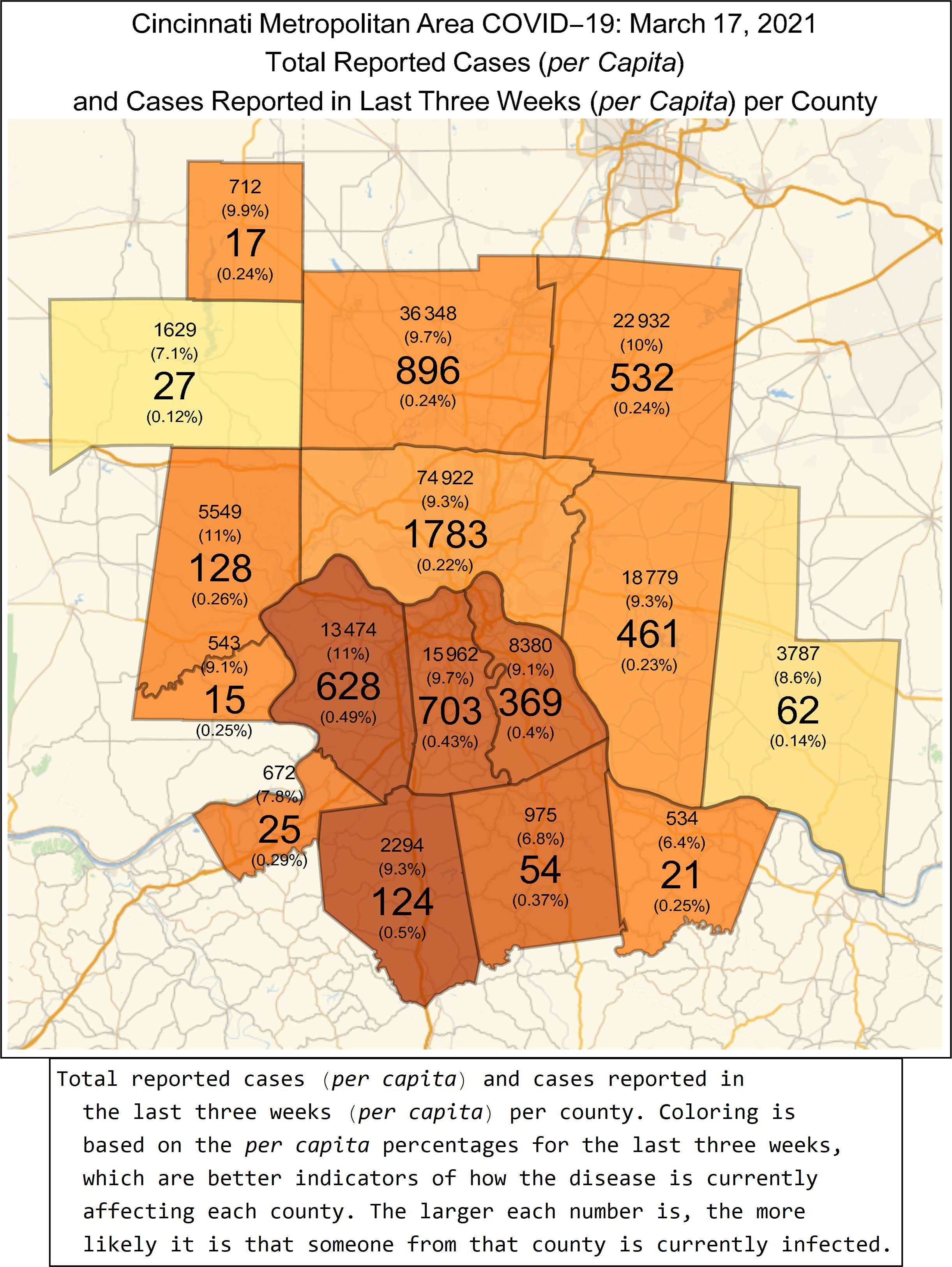
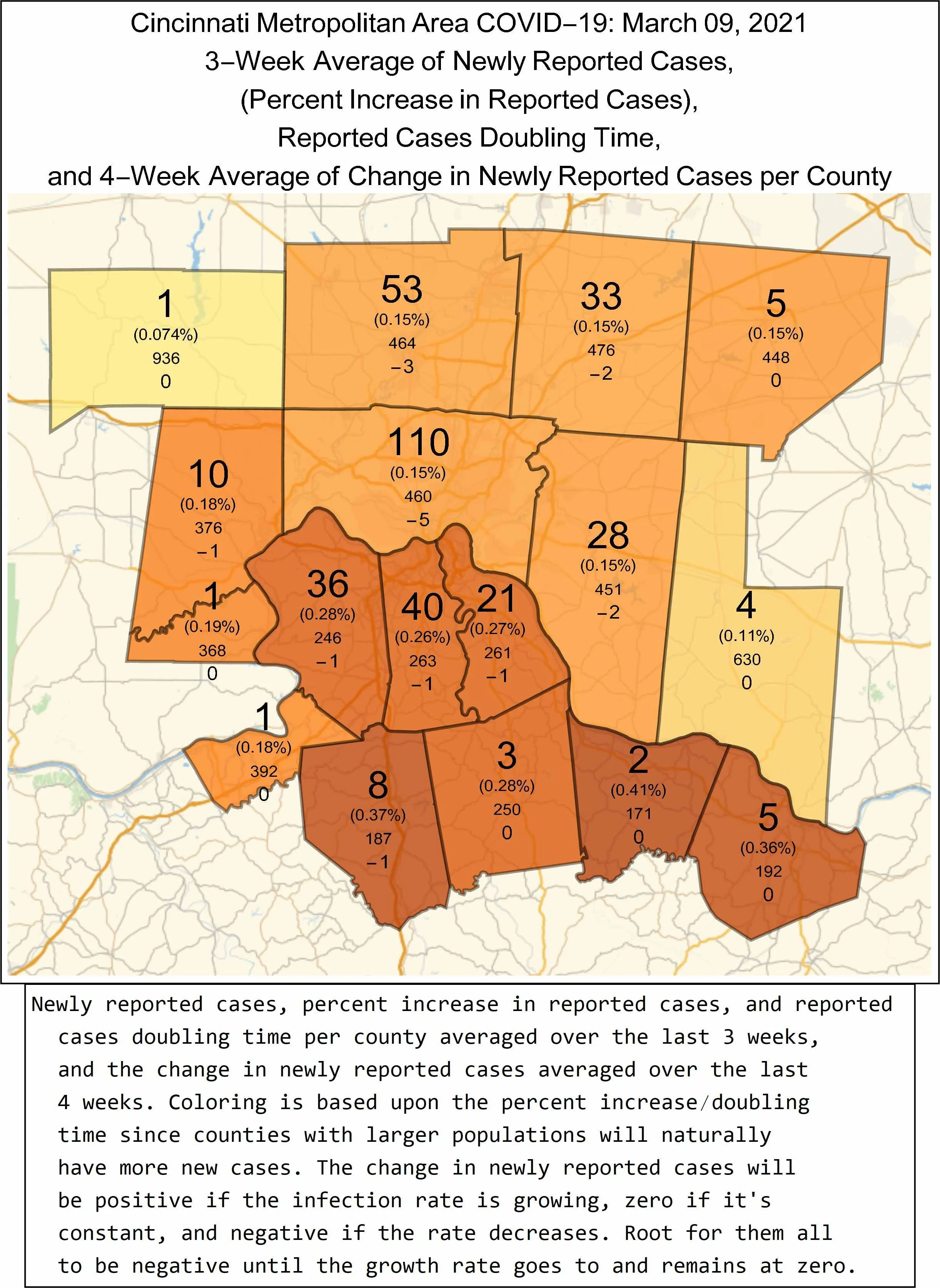
Then came the maps. This was a more significant challenge because following the new things I had learned—and the haphazard way I mashed it together the first time around—I decided to completely revamp the way the map data was compiled. This introduced a whole host of challenges and revealed several problems with my earlier method. It took way longer than it should have, but I eventually outsmarted the machine and arrived at something with which I am happy. But as with the graphs, changes had to be made on account of the Ohio data. Well, I suppose one change: averages extend out at least three weeks—a week beyond the “preliminary zone” declared by the ODH. Everything else is the same as far as the reader can tell. (But I assure you it’s way better behind the scenes!)
As always, this is still a work in progress. I have ideas for new plots, such as the number of vaccinations given. (I can make that a reality if I can find the relevant data for Kentucky and Indiana!) If there is anything specific that you’d like to see, let me know. Or, if you find any mistakes (such as old information that I’ve accidentally carried over from the previous version), also let me know. Your input is much appreciated!
PLEASE READ: I hope the service I’m providing here is of value. If you believe it is, please consider donating to keep the project going. Money is needed to cover the annual hosting fee for this website and the yearly license fee for the software used to analyze and visualize these data. I currently pay for everything on my own, and I will continue doing so for as long as possible. But your assistance is much appreciated and will ensure this project continues until the pandemic ends. If you are able and willing, one-time donations can be made through the support page, and recurring monthly donations can be made via Patreon. Thanks!
GET VACCINATED IN THE CINCINNATI METROPOLITAN AREA
Click the link for more information: https://eiben.space/covid19-vaccine.
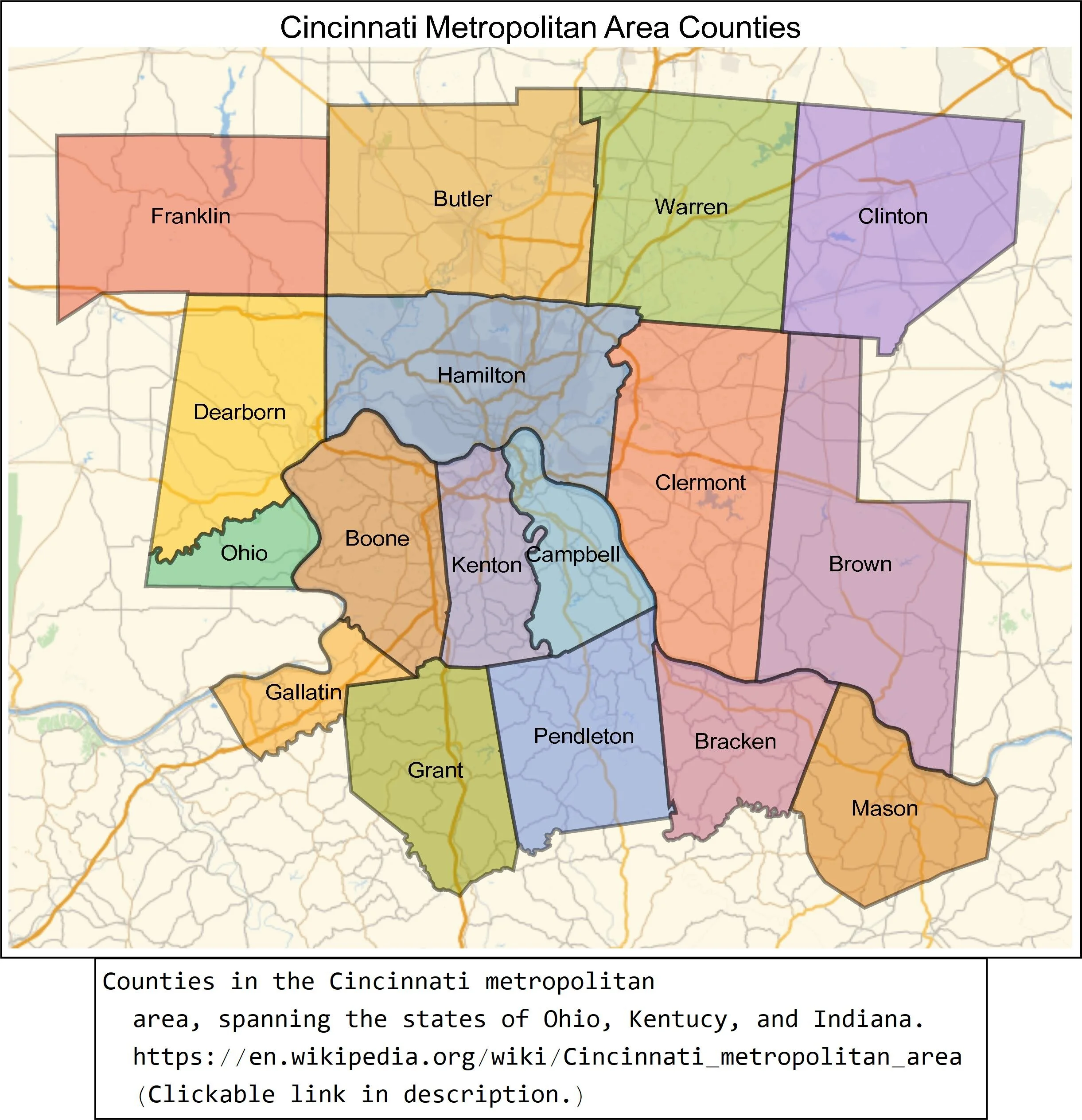
Cincinnati Metropolitan Area: https://en.wikipedia.org/wiki/Cincinnati_metropolitan_area
Referenced Video: https://youtu.be/54XLXg4fYsc
Data Sources: Ohio Department of Health and the New York Times


