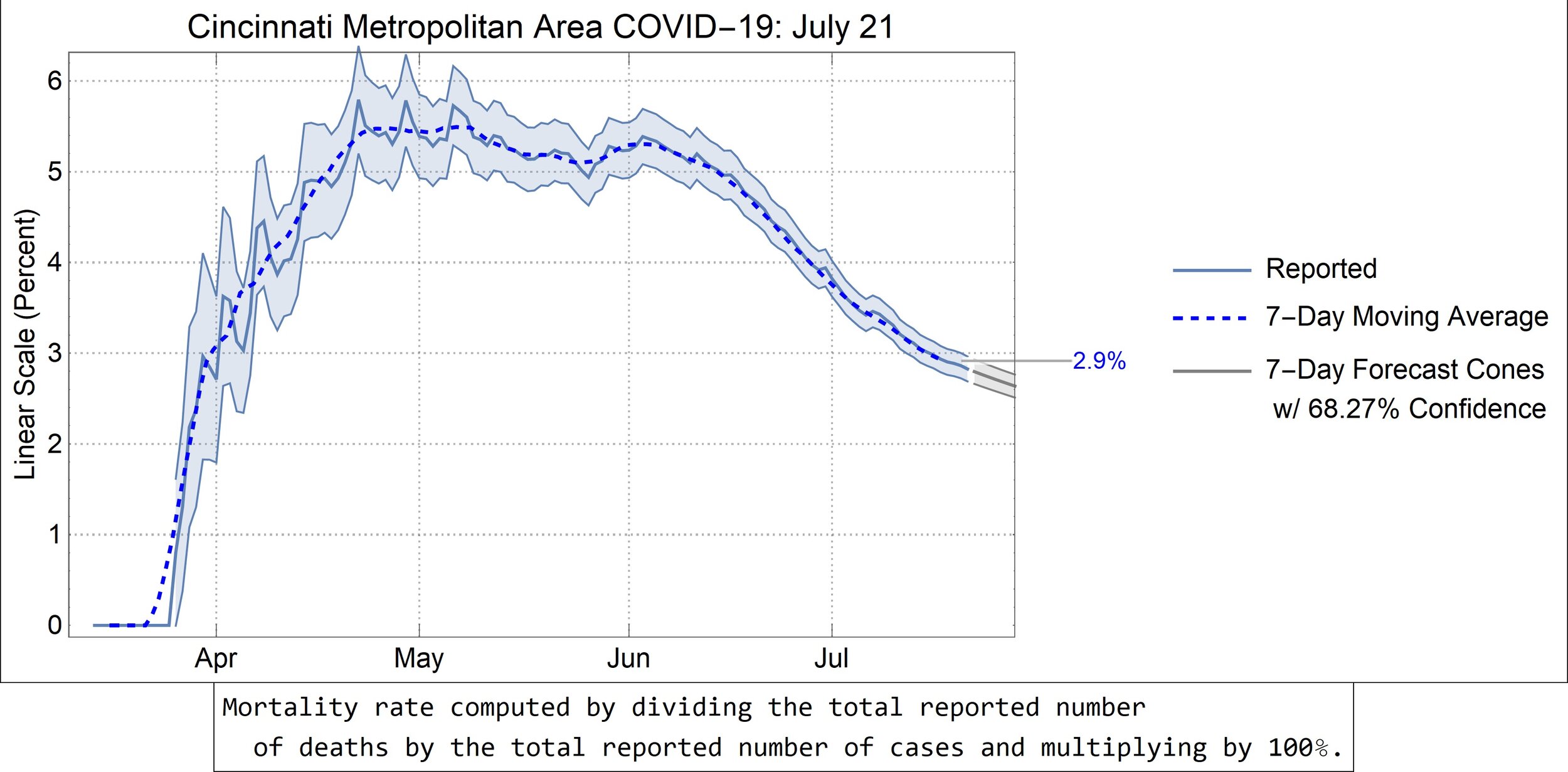
Cincinnati Metropolitan Area COVID-19: July 21st, 2020
That (insofar as I can tell) reporting anomaly at the beginning of July was bothering me. So, I fixed it!
For those unfamiliar, a mere 18 new cases were reported on July 2nd, followed by 518 new cases on July 3rd. These values were at the fringes of—if not beyond—the uncertainty bands of the nearby newly reported cases and they caused some significant hiccups in that and related graphs. I got tired of seeing those spikes, so I smoothed out that datum by replacing it with the mean of the values before and after that day.
In other words,
\[ \begin{array}{ccc} \begin{array}{c} \text{Original Reported Cases} \\ \begin{array}{|c|c|c|}\hline \text{Date} & \text{Value} & \text{Difference} \\ \hline \text{July 1st} & 10107 & - \\ \hline \text{July 2nd} & 10125 & 18 \\ \hline \text{July 3rd} & 10706 & 581 \\ \hline \end{array} \end{array} & \begin{array}{c} \\ \Longrightarrow \end{array} & \begin{array}{c} \text{Modified Reported Cases} \\ \begin{array}{|c|c|c|}\hline \text{Date} & \text{Value} & \text{Difference} \\ \hline \text{July 1st} & 10107 & - \\ \hline \text{July 2nd} & 10406 & 299 \\ \hline \text{July 3rd} & 10706 & 300 \\ \hline \end{array} \end{array} \end{array} \]
where the new July 2nd value is \( \left( 10107+10706 \right)/2\) rounded to the nearest (even) integer.
Consequently, everything’s a lot prettier.
Cincinnati Metropolitan Area: https://en.wikipedia.org/wiki/Cincinnati_metropolitan_area
Referenced Video: https://youtu.be/54XLXg4fYsc
Data Source: https://github.com/nytimes/covid-19-data


